
We Asked 100 People to Draw Famous Logos from Memory. Here Is What They Drew.
The logo is the focal point of any brand. The first point of contact between you and your customer, an effective logo can express your business’s product, culture, and goals on items such as gifts and merchandise such as promotional pens to technology such as apps.
To gain some insight into modern-day branding, we handed 100 people some coloured pens and embarked on an experiment. Then, we asked experts in marketing and branding to give us their tips on how a business of any size can develop a memorable logo that resonates with its audience.
What we did
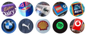
First, we chose 10 of Europe’s biggest brands. Covering a variety of industries, the shortlist contains some of the most recognisable consumer names in international business:
- Aldi
- BMW
- Cadbury
- Lacoste
- Lego
- Puma
- Red Bull
- Shell
- Spotify
- Vodafone
- 17% of drawings contained just an “A” rather than the full brand name
- 22% of drawings coloured the text in yellow
- 31% of drawings didn’t include any text in their logo
- 5% of drawings more closely resemble the logos of other leading German car brands
- 24% of drawings included pouring jugs in their logo
- 50% of drawings incorrectly spelt the brand as “Cadburys” or “Cadbury’s”
- 31% of drawings had their crocodile facing the wrong way
- 85% of drawings didn’t include red in the crocodile’s mouth
- 82% of drawings didn’t include all four correct colours: yellow, red, white and black
- 27% of drawings didn’t wrap the text in a box
- 45% of drawings had the puma facing the wrong way
- 39% of drawings didn’t include the brand name
- 28% of drawings included just one bull
- 61% of drawings didn’t include the full brand name
- 12% of drawings included orange in their logo
- 10% of drawings included horizontal lines rather than vertical
- 46% of drawings used a darker shade of green than the real logo
- 16% of drawings added more than three horizontal lines within the circle
- 12% of the drawings have the Vodafone speech mark facing the wrong way
- 17% of drawings have not featured the speech mark (or some variation of it) at all
We then asked 100 members of the public to draw each logo of the above brands. Drawn by hand, they had a total of 30 minutes, with no restrictions on colours and absolutely no use of the internet. Here is what we found.
Aldi
 Common mistakes:
Aldi is one of the biggest names in the supermarket industry. Despite the regularity with which many of us see it, their logo was one of the least successfully recreated out of our 10. By the looks of things, some drawers just chanced their arm and guessed. Among the 100, you can find a padlock and what looks remarkably like the Windows PC logo.
BMW
 Common mistakes:
BMW is one of the most recognisable brands on the planet, but for some, the crowded German car industry caused confusion. Despite plenty of successful logos, some drew versions of their competitors. In the image above, you’ll find a number of Mercedes-Benz logos, and even a couple of iterations of the Volkswagen logo.
Cadbury
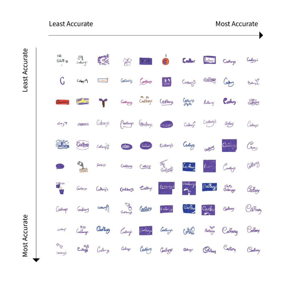 Common mistakes:
Despite being possibly the biggest name in chocolate, our participant’s attempts to draw Cadbury’s logo resulted in some interesting results. We admire the honesty of the least accurate drawing of the lot. Clearly not an indulger in chocolate, one drawer simply wrote “No Clue”.
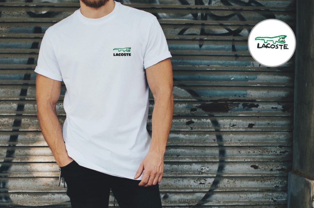
Lacoste
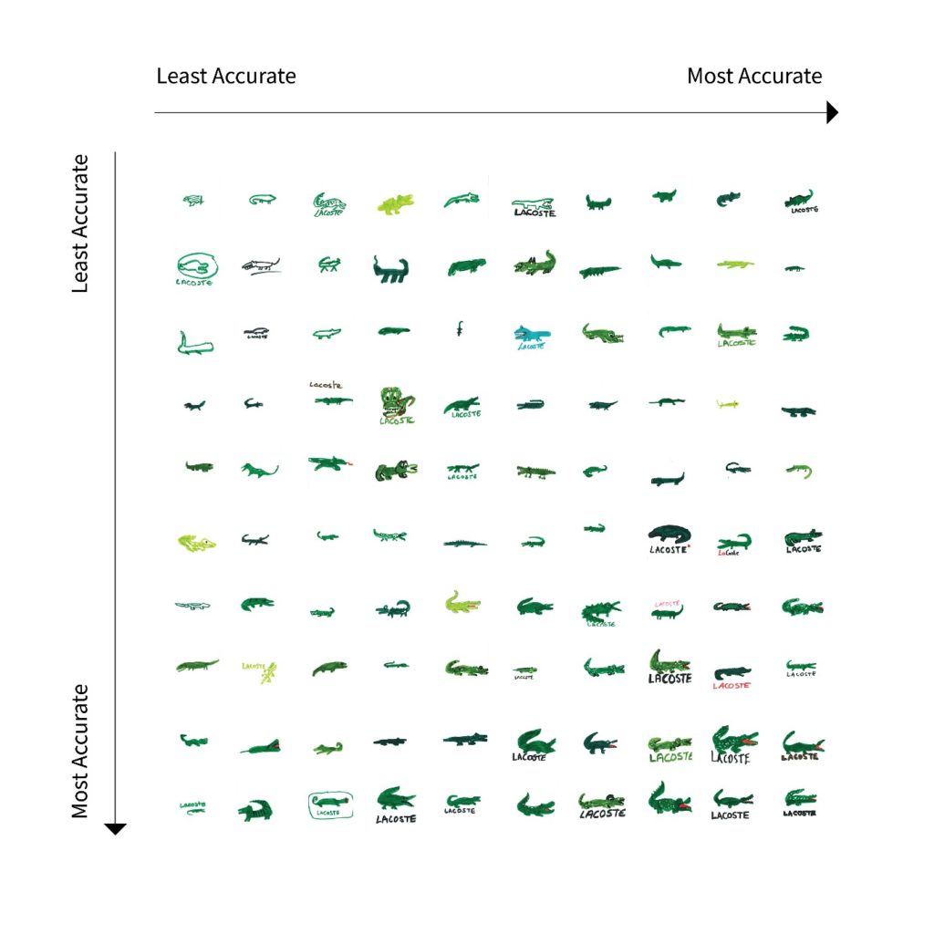 Common mistakes:
French sports clothing brand Lacoste is familiar for one thing – the crocodile. It appears to have paid off though with everyone drawing some form of the reptile; or at least we think they have. Among the 100 crocs are some fairly loose interpretations, with all kinds of shapes, sizes, and expressions used.
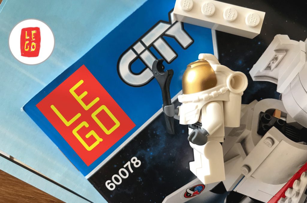
Lego
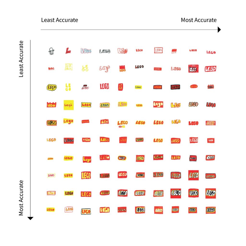 Common mistakes:
Lego was one of the most consistently drawn logos of the lot, but we can still give one honourable mention to the least accurately drawn out there. For one participant, they used it as an excuse to get a bit creative and draw a little person with what appears to be a Lego brick for a body.
Puma
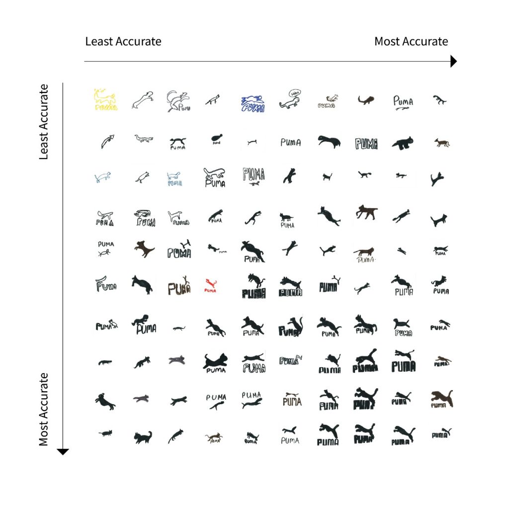 Common mistakes:
Back to the clothing industry again with Puma. Again, animals are our subject’s downfall. Glance over the big cats drawn above, and you find various different members of the animal kingdom. Everything from tadpoles to birds are found in our participants’ attempts to recreate the Puma logo.
RedBull
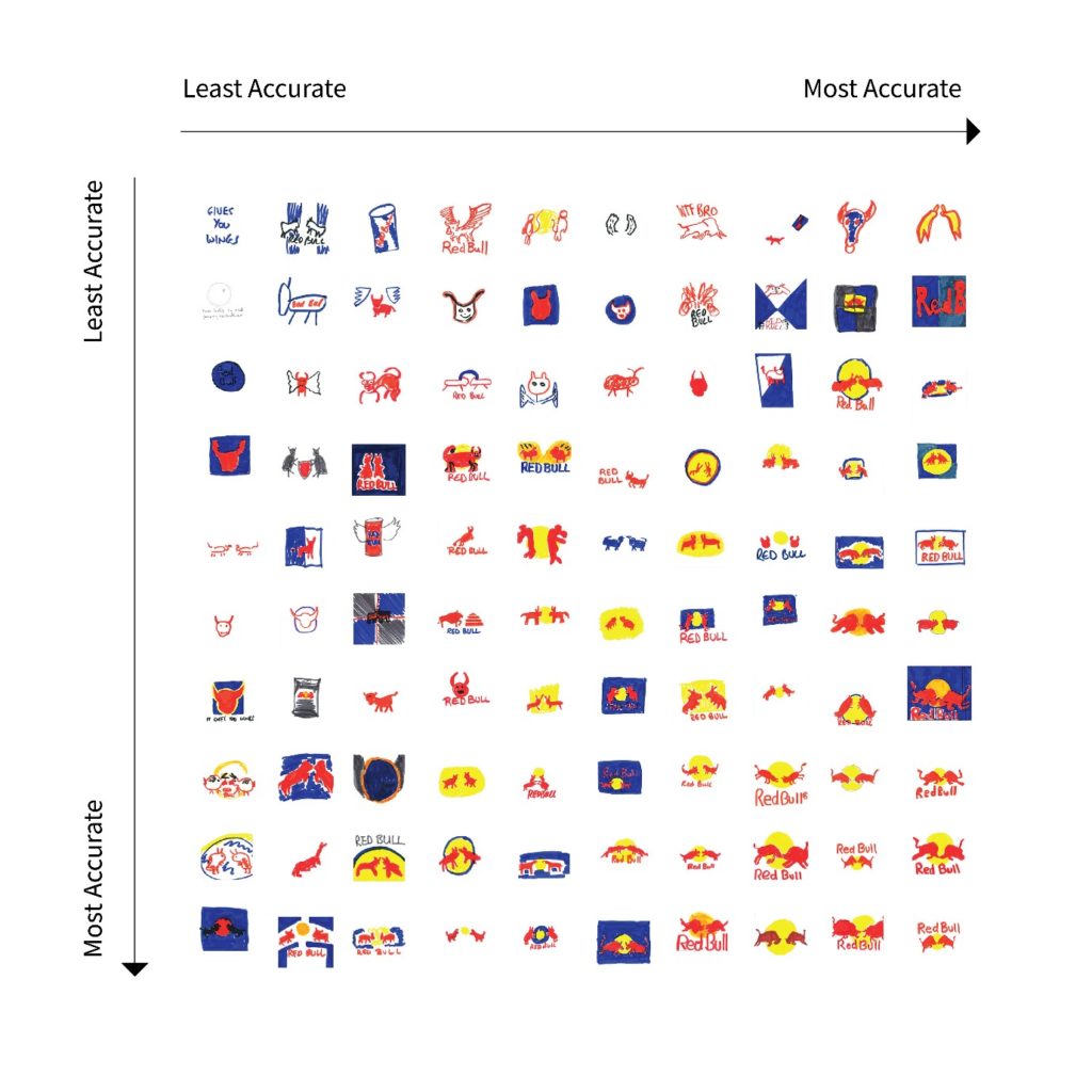 Common mistakes:
Red Bull has one of the most complex logos of our 10, which led to some of our drawers confusing different elements of their brand. Wings, which aren’t a part of the real logo, have been drawn by many different participants. One even included a part of the famous slogan “Red Bull Gives You Wings”. Often, a slogan is even more memorable than a logo.
Shell
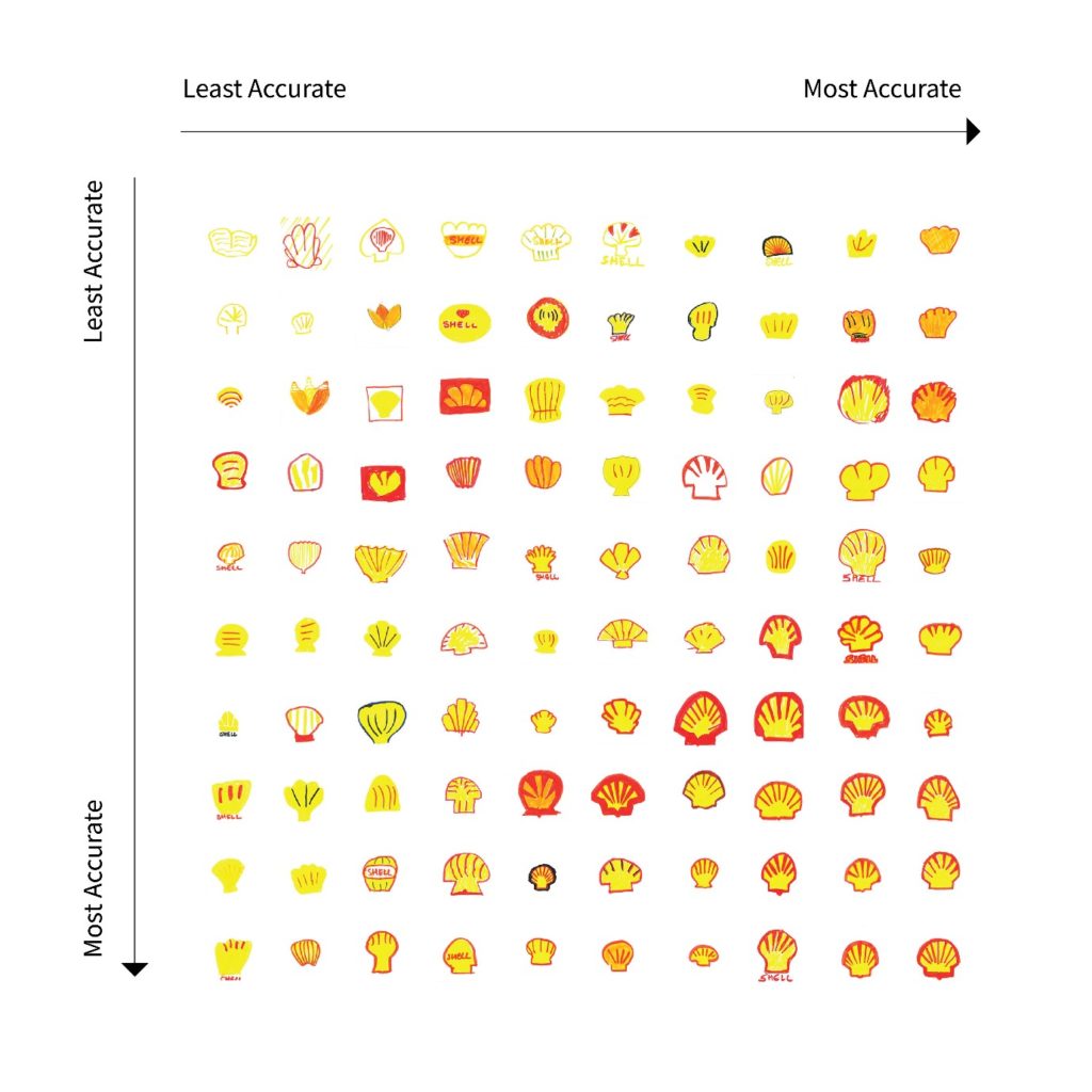 Common mistakes:
Again, the simplicity and literal connection of brand name and logo ring true with the accuracy of Shell. For some, however, the shell was still a stern test of their drawing capabilities. We can find more than a couple of logos that more closely resemble flowers, leaves, and maybe even the odd mushroom.
Spotify
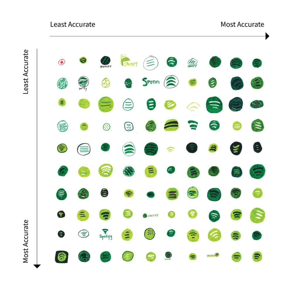 Common mistakes:
Founded just 13 years ago, Spotify is by far the youngest of the European powerhouse brands on our list, which might explain the level of success our drawers had recreating it. 99 of the recreations bear some resemblance to the real thing, with only one outsider. The solitary red dot in a circle stops Spotify from achieving a full house.
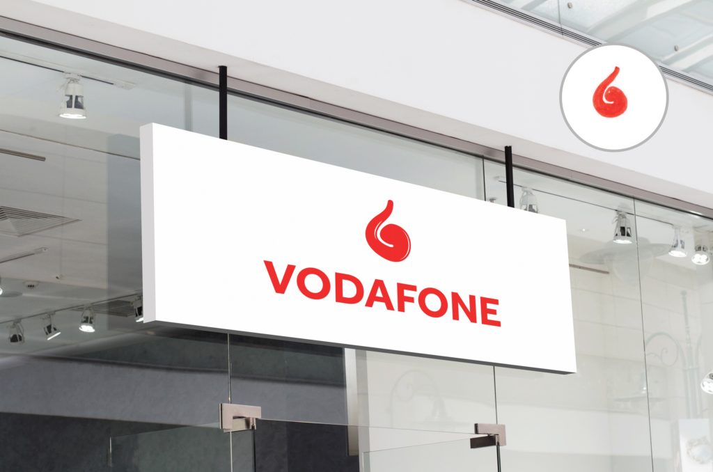
Vodafone
 Common mistakes:
Vodafone’s logo has one of the most recognisable features in all of UK branding. The memorable speech mark icon features in all but 17 of our 100 drawings. However, what those 17 went for instead does leave some questions. Aside from some understandable “V”, you can find a diagonal line and a red box.
What our logos would look like in the real world
Given the interesting variety of designs we had from our 100 creators, we decided to mock-up a select few as if they were the real thing. Here’s what they’d look like:
How to develop a standout company logo
Given the unreliability we found when asking 100 members of the public to draw some of Europe’s biggest brands, how can a small business hope to create something memorable? We asked marketing and branding experts for their top tips on creating an unforgettable logo.
Consider your brandBoiled down to its very essence, the logo is a single icon that represents your business. As Fabian Geyrhalter from branding agency FINIEN confirms, your logo should say a lot about your organisation.
“Your design doesn’t have to capture the entire story of your brand, but it should represent a unified idea about the purpose of your brand. Every design decision that shapes your brand mark will contribute to its narrative, which can be represented through shapes, symbols, styles, colours, and typography.
“The Amazon logo looks deceptively simple at first glance, but if you contemplate the placement of the arrow below the logotype you will see it is communicating something deeper about the experience Amazon aims to give its customers. For example, the arrow points from the a to the z, which alludes to the wide range of products that the site sells.”
Colours are important
During our experiment, colours were the one area where our participants came close to reality. Instantly recognisable and bankable in our memories, getting your colour scheme right is an important step to creating a good logo. Audrey Strasenburgh from LogoMix commented.
“Colour psychology is alive and well in the logo design world, so make sure you choose a colour that suits your brand’s personality. If you’re a health food store or a yoga studio, you may not want to choose red as your main colour. Do some research on colour psychology and what colours are most popular in your industry, and don’t pick more than three.”
Simplicity is key
Glance over the evolution of branding over the last couple of decades, and you’ll find an overall simplification of logos. Lizzie Dunn from Fundera thinks this is the way to go if you are to build an impactful modern logo.
“Simplicity is everything. When a potential customer sees your logo, you have one opportunity to nail your first impression, and an overly intricate logo can potentially blow it. Do away with any colours or elements that don’t contribute to the meaning, message, or core structure of the logo itself. Less is more.”
Developing a logo that’s unique, memorable, and resonates with your customers is one of the toughest challenges a business will face. Even for Europe’s biggest brands, an accurate recollection of their logos is hard to come by. Creating a stand-out representation of your brand may prove difficult, but it could be the key to separating yourself from your competitors.